top of page


packaging
Below are the five droplet bottles for Vivid Edible Skincare.
With this design, I wanted to lean into the clean minimalist aesthetic outlined in the brief from the customer. Pairing bright gradients with white to complement the uses centred in the middle of the front-of-pack.


advertising

social media content
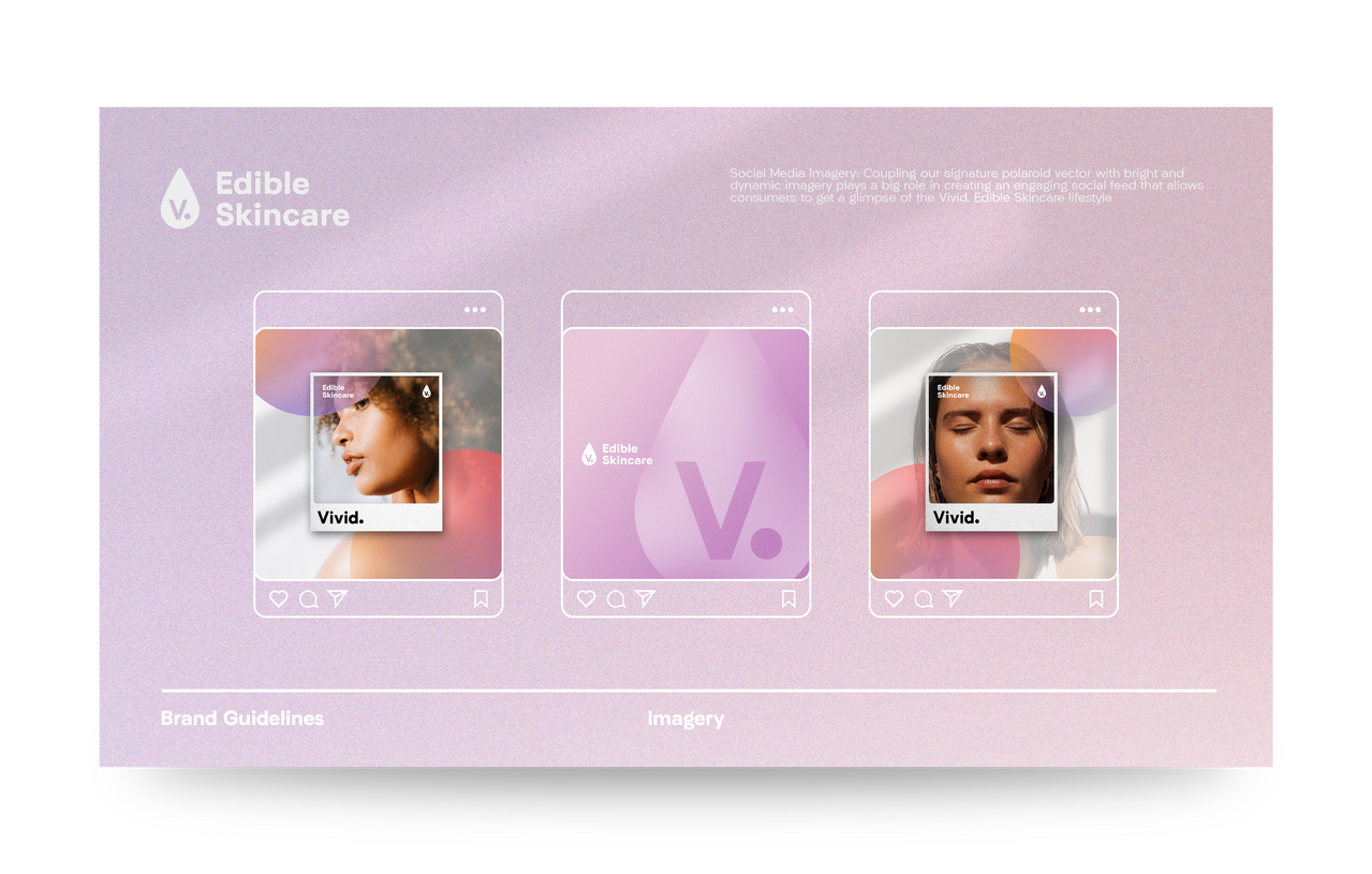
Below are examples of social media posts I was asked to develop near the end of the timeline for this project. I worked to create graphics to be posted on the brand's social media channels that helped to outline directions for use and its benefits.


brand guidelines
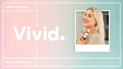
Vivid edible skincare
I was contacted to develop the branding identity for Vivid Edible Skincare, a new-to-market edible serum combining key skincare ingredients, antioxidants, vitamins, and minerals that provide targeted nourishment to the skin
The brief from the client outlined that they were after a clean and minimalist wordmark logo and icon that helped to allow the products to stand out in stores and online, while also speaking to the high-quality, natural ingredients used in the serums.

amazon listing imagery


amazon listing imagery
With five SKUs including remedies for oily and acne prone skin, I wanted to differentiate these products by using the five gradient shades that have been outlined in our brand guidelines (below). Using these soft gradients helps to create a soothing and streamlined packaging that helps them to standouts out on the ever-saturated digital shelf.


bottom of page


